Tokibem
Tokibem
Tokibem
Actual client brief · Individual · 2025
Actual client brief · Individual · 2025
Actual client brief · Individual · 2025
Branding
Logo Design
Design System
Branding
Branding
Logo Design
Visual Identity
Logo Design
Visual Identity
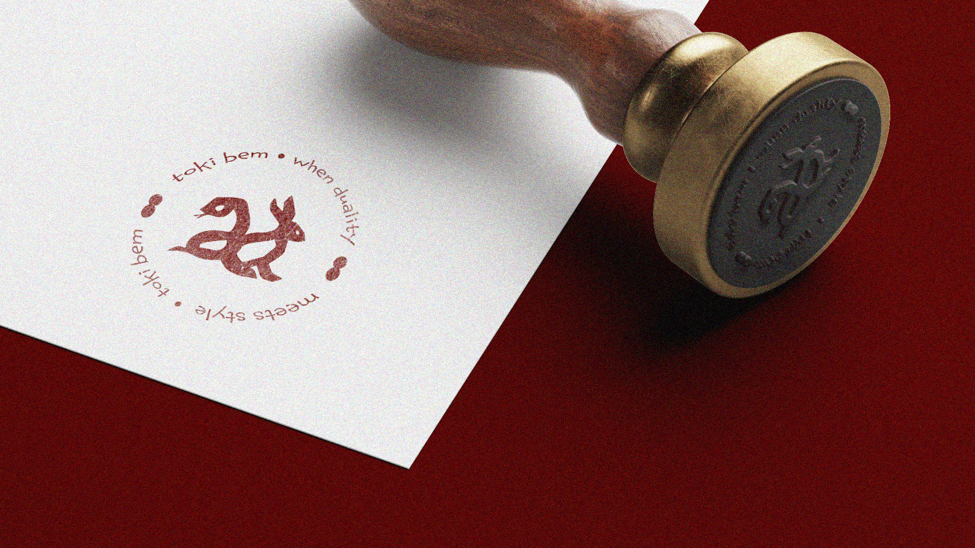
Tokibem is an American-Korean fashion brand that celebrates the duality of personality through clothing, blending playful charm with bold elegance. Inspired by the symbolic fusion of the rabbit and the snake from the Chinese zodiac, the brand identity reflects a balance of contrasting traits: cute and confident, soft and fierce.
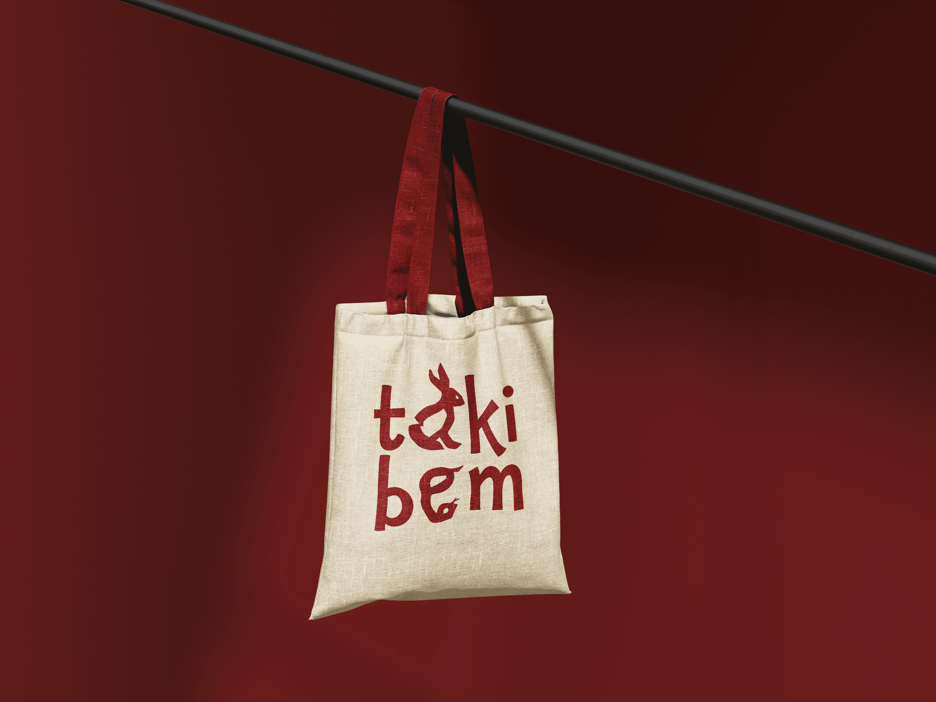
I developed a full visual identity around this contrast, using a curated palette of rich reds, soft pastels, and clean neutrals. The typography pairs an expressive, playful custom wordmark with a sleek, modern secondary type system, capturing both the cute and confident sides of the brand across logo design, packaging, signage, and merchandise.
Tokibem is an American-Korean fashion brand that celebrates the duality of personality through clothing, blending playful charm with bold elegance. Inspired by the symbolic fusion of the rabbit and the snake from the Chinese zodiac, the brand identity reflects a balance of contrasting traits: cute and confident, soft and fierce.
I developed a full visual identity around this contrast, using a curated palette of rich reds, soft pastels, and clean neutrals. The typography pairs an expressive, playful custom wordmark with a sleek, modern secondary type system, capturing both the cute and confident sides of the brand across logo design, packaging, signage, and merchandise.
Tokibem is an American-Korean fashion brand that celebrates the duality of personality through clothing, blending playful charm with bold elegance. Inspired by the symbolic fusion of the rabbit and the snake from the Chinese zodiac, the brand identity reflects a balance of contrasting traits: cute and confident, soft and fierce.
I developed a full visual identity around this contrast, using a curated palette of rich reds, soft pastels, and clean neutrals. The typography pairs an expressive, playful custom wordmark with a sleek, modern secondary type system, capturing both the cute and confident sides of the brand across logo design, packaging, signage, and merchandise.